You might've seen me tease a few screenshots in the MUGEN Screenshots thread, but since I'm now putting more effort into it and want to make it good, and hopefully get some feedback, I decided to start a thread on it.So a few days ago, I was browsing the Five Nights at Freddy's wikia and wading through stupid shit about people's theories about the game, and I saw someone mention that it would be cool if the game had an 8-bit demake. Now most people associate 8-bit with PIXEL ART HIPSTER GAMES but I decided to take it one step further and attempt to follow the rules set by the NES/Famicom, and do it in a style reminiscent of shitty bootleg Famicom games from Hong Kong like Super Donkey Kong 2.Spoiler: The Rules for NES/Famicom Coloring, correct me if I'm wrong with something (click to see content)- The Famicom has roughly 54 uniquely usable colors, not counting duplicates and one shade of gray that, while slightly darker than one of the shades, is not different enough for the human eye to detect it).- All palettes have four colors: three of which are actually visible, one which is either a background color for BGs or a transparency for sprites.- The BG Layer is allowed to have four palettes loaded at maximum, and all must share the same background color.- The Sprite Layer is allowed to have four palettes loaded at maximum.- All together, the maximum number of colors you can have on screen at any given time is 25 (1 BG Color, 12 BG tile colors, and 12 sprite colors)There are some rules I'm not following (ie: making sure I don't exceed either of the two sets of 256 tiles allowed, sprite memory limitations, etc) because that's just insanity, so if I do accidentally follow them, it's entirely accidental.I decided to use the office from FNaF2 instead of FNaF1 because it has a visible floor that you can use for a MUGEN stage. The color variety in the original is pretty varied, so I had to make a lot of sacrifices. I didn't feel like tinting the walls would've looked scary, so I went with grayscale. I messed around with the brightness/contrast so that I could make the TVs pop out a bit more without messing up the shading on the walls, drew in some parts for the TVs that were just too obscured by shadow, and tried to tone down the shadows with some cross-hatching. I kept unique colors for the poster/drawings and the warning signs because I felt that their placement added nice accents. Total color count (including transparency) is 11 colors, so I'm safe for the BG layer.NOW FOR THE SPRITESTo make things easier for myself, I decided to limit myself to three colors for either of the air vents, and nine for the hallway.(NOTE: For the sake of making an easy visual reference, I'm considering the black parts of these images to be transparent as well. They're mostly here for my own benefit.)Left VentBalloon Boy and Toy Chica. Balloon Boy was a pretty straight-forward conversion with very minor touch-ups (although I might go back and fix a few off pixels. Toy Chica, however, required flat-out redrawing lots of her, including her mouth, hair, and eyes.As you can see, I attempted to do the hallway sprites (top picture, Bonnie and Foxy), but the results so far are all over the place. For example, I really love how Bonnie turned out there, but I'm going to need to do a LOT more work on Foxy (I'll probably just end up redrawing him entirely).Anyway, anyway, any feedback would be greatly appreciated!
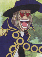
Now for the Right Vent!Toy Bonnie and The Mangle. This proved to be infinitely more challenging than the Left Vent. I had to redraw quite a lot in order to get this to look right, and a big part was from me trying to make sure Toy Bonnie's palette looked different enough from Balloon Boy since I also chose blue for him. The Mangle was another tricky one and at one point I considered shading him pink (hence the blue transparency), but it took away from the scariness so I kept him grayscale.So that takes care of the vents, Now for the fun (?) part: The Hallway.EDIT: Also here's one that isn't in the game but I just wanted to try it out for shits and giggles. 10 points if you can guess what game it's from.
Alright, attempted Foxy/Bonnie again.Foxy's head is still probably too bright but at least he doesn't look as shitty as his first attempt. I kinda-sorta cheated by working with Foxy's pose when he's alone in the hallway. All together, this is 8 colors (Bonnie's eye shares colors with the highlights on Foxy's body, and Foxy teeth share colors with Bonnie's belly).I have to say, it's a LOT harder to downgrade the hallway graphics because the flashlight is super-imposed over the images, but I'm getting there!
I don't usually give mindless praise, but this looks fucking amazing. If you ever wanted to do more stages like this, I'd be interested in helping. Holy fuckballs this is great.EDIT:Upon further inspection, you could use the lightest yellow color hue for the light in the center above the hall. It looks too flat(even for 8-bit) in my opinion. But I'd need to see it changed before I'd say if it worked or not.
This was my quickie attempt at adding the light colors in (really it's all just recycled from the papers on the wall lol). I dunno if this is what Hoshi meant, but I'll admit it adds a nice accent so I might end up keeping it.Also I made another animatronic. The only thing? It never appeared in the Hallway in the original game; it only appeared RIGHT IN FRONT OF YOU.Scaled for easier comparison. Here's the original at full resolutionI put Chica in the hallway because otherwise, she would never appear at all, which is a shame because she's one of my favorite old animatronics in FNaF2. I actually had one more color I could've messed around with, so I was going to try make the red wires coming out of her arms, but it didn't work out as well as I thought it would, so I just kept it simple and stuck to my existing palette.JUST AS AN ASIDE, I know multiple animatronics show up in both the hallway and the vents, but I think it would probably be for the best if I didn't do every possible thing that appears in the hallway (otherwise we'd have a Foxy overload). So if I cut out all the duplicates, that just leaves me with the three Freddy variants (Old, Toy, and Golden). That seems a little unvaried and while it would go against what happens in the game, I might throw in The Puppet for some variety.After that, I'll probably throw in some of the easter eggs like Shadow Bonnie or Paper Balloon BoyEDIT: Touched up Chica some more.
Ladies and Gentlemen, Boys and Girls, I have one question for you:ARE YOU READY FOR FREDDY?!Toy FreddyOld FreddyGolden FreddySo you're probably wondering why I'm using the office poses instead of their Hallway ones. Two reasons: One, their poses are more dynamic in the office. Two, it's easier to work with the lighting. Oh and I guess to add a third reason, Golden Freddy's hallway pose is just a giant disembodied head because of the nature of his character (I won't say more than that since it treads into spoiler territory).Golden Freddy was the easiest to make, and all I did was adjust the palette and fix up his teeth a little. Old Freddy was cropped off in his original pose, so I actually had to add in an ear and his tophat (I sprited it myself, figuring that highlights would give off the illusion of it being there). Toy Freddy was also kinda cropped off, but only at the feet so I just BS'ed a fadeout down there (I also drew his legs entirely from scratch!)So since I'm almost done, I guess I'll share some notes that I learned while making these.Spoiler, click to toggle visibilty- If you find that you have room for some extra colors in your palette, add colors at your own risk. I've found that maxing out the palette makes the resulting image have less of an impact. Smaller palettes with careful color management tend to work out better in my experience.- I've generally gotten better results by grayscaling the entire image, upping the contrast, reducing the entire thing to four colors (three shades of gray, and black), then putting in the colors that way. It's an old trick but it's very helpful!- Black is a wonderful color (?). You can use it for shadows, accents, and creating a sense of something lurking in the distance.- Red is a really fucking terrible color to work with on the NES because it's more pinkish than actually red.- There's a lot of green to work with. Too bad I never used it!- ALWAYS minimize your photo editing software if you're going to take a break and your computer's monitor automatically turns off. It is creepy if you're up before the sun rises and you get greeted by an animatronic bear trying to grab you from the computer.With that, now it's just touching shit up (starting with Foxy and Chica). Afterwards, maybe I'll throw in some non-canon animatronics, and maybe even try demake the first Five Nights at Freddy's. Who knows?
DragonSlayerEX said, December 11, 2014, 01:03:03 amMarkiplier, & PewDiePie would be proud! Best of luck to you. I second this. Also, fixed This stage retains all the fear factors from FnAF2, IMO. I swear, its still as creepy looking as the original (which is good, I think)?I wonder if Markiplier would ever try out M.U.G.E.N though. He'd probably download this stage in a heartbeat Anways, good luck Jango!P.S. I couldn't figure out who the green-lookin character was in one of Jango's posts. Anybody discover who he is yet??
DragonSlayerEX said, December 11, 2014, 01:03:03 amMarkiplier, & piewdiepie would be proud! Best of luck to you. I think if Markiplier liked it, that would be all sorts of cool, especially since my kid brother is a huge fan of his. He'd be like "Woah Markiplier likes your stage!" Although I don't think Mark would touch MUGEN unless someone linked him to The Black Heart or something. Someone please do that.Black Hatter said, December 11, 2014, 01:12:35 amThis stage retains all the fear factors from FnAF2, IMO. I swear, its still as creepy looking as the original (which is good, I think)?I think a big factor of it is the NES' limitations. Video games today are getting more and more vivid and lifelike, but what you see is what you get. I feel that NES game graphics tend to be more based on "concept" rather than trying to make something look realistic. It gives you a representation of what it's supposed to be, and your own imagination fills in the blanks. Sweet Home is a prime example of this, and I think anyone playing it would get at least somewhat creeped out early on.I think that idea also applies to Five Nights at Freddy's (the first one), because a lot of the horror from that game came from your mind filling in the blanks as to what was going on, like hearing Chica eating in the kitchen or Freddy laughing whenever he changes rooms, or even just looking at the darkened doorways knowing that at any given moment, something could stick its head through the door.tl;dr it probably works because the way NES graphics compliment the mood that FNaF sets.Black Hatter said, December 11, 2014, 01:12:35 amP.S. I couldn't figure out who the green-lookin character was in one of Jango's posts. Anybody discover who he is yet??You might be surprisedSpoiler, click to toggle visibiltyI bet a bunch of the characters from Rare's old games could make decent animatronics with some editing.
lol never thought it be that turtle I think that pretty much every character from diddy kong racing would work or a fulgore animatronic could also be pretty cool
Jango Hakamichi said, December 11, 2014, 02:28:35 amI think a big factor of it is the NES' limitations. Video games today are getting more and more vivid and lifelike, but what you see is what you get. I feel that NES game graphics tend to be more based on "concept" rather than trying to make something look realistic. It gives you a representation of what it's supposed to be, and your own imagination fills in the blanks. Sweet Home is a prime example of this, and I think anyone playing it would get at least somewhat creeped out early on.I think that idea also applies to Five Nights at Freddy's (the first one), because a lot of the horror from that game came from your mind filling in the blanks as to what was going on, like hearing Chica eating in the kitchen or Freddy laughing whenever he changes rooms, or even just looking at the darkened doorways knowing that at any given moment, something could stick its head through the door.tl;dr it probably works because the way NES graphics compliment the mood that FNaF sets.Oh yeah, Sweet Home is the best example. Even looking at the gameplay on Let's Play vids woudl creep the shit outta me. You basically just summed it up, my friendJango Hakamichi said, December 11, 2014, 02:28:35 amYou might be surprisedSpoiler, click to toggle visibiltyI bet a bunch of the characters from Rare's old games could make decent animatronics with some editing.*In muyskerm's voiceOh hot-damn! Hahaha! That's actually not a bad idea, man!
So me being the silly buggerboo that I am, as I was putting the images into the SFF I noticed that I made Freddy too tall . I had to shrink him down by 10%. The difference isn't too big, although I had to take some time (about 10-15 minutes) to redraw some bits that didn't get downgraded too well.Also after doing some tests, it looks like I'll probably end up doing the Golden Freddy Head in the hallway after all (although I'll probably hang onto the Golden Freddy I have to make some rare appearances in the office since he's big enough for it)
Jango Hakamichi said, December 10, 2014, 05:50:45 amI dunno if this is what Hoshi meant, but I'll admit it adds a nice accent so I might end up keeping it.Mostly what I was talking about. Here's a further adjustment.
Hallway Golden Freddy completedLike the others, I didn't use the Hallway renders, but to be honest, it's not that different. My source was instead his really shitty killscreen.And on a related note, QUICK, TO THE FREDDYMOBILE!Spoiler, click to toggle visibilty
The .gif? Nah, it's a common .gif joke about FNaF2 having really shitty kill animations, the worst one being Golden Freddy's disembodied head flying straight at you but otherwise with no animation at all.