YesNoOk
avatar

Judas STUFF (Read 197282 times)

Started by [Judas], July 10, 2012, 09:42:15 pm
Re: Judas STUFF
#41  December 14, 2012, 07:41:39 pm
  • avatar
  • ***
  • I do use dark colors. . . : \
    • kurotoboe.deviantart.com
Man this shit is marvelous!!!!
I'm trying. . .
Re: Judas STUFF
#42  December 18, 2012, 08:49:28 pm
  • ***
  • Merciless.
    • USA
    • blackdevilscream.com
Thank you, sir!

Uh... combo counter font.

I should probably do some actual sprites some time soon, but eh... I'm compelled to finish this stuff first.

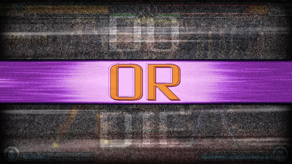
An annoyingly downsized version of the prefight intro as of now.

God, photobucket. What's the standard for image hosting large-ass images these days? Out of the loop on stuff like this.

Now that I look at it, the FIGHT part seems kinda plain. Maybe keep the static from the first part (minus the DO OR DIE part of it, of course) and have it gradually fade out as the ring expands? Maybe some black bars at the top and bottom at about 50% opacity? Maybe both? I'unno. Ideas, plz

Spoiler, click to toggle visibilty
Last Edit: November 08, 2017, 02:45:55 pm by AlexSin
Re: Judas STUFF
#43  December 19, 2012, 12:38:34 am
  • ***
  • SEIYAA!
    • Sweden
    • artbyjiggeh.tumblr.com
I think it comes across as a bit dull since it's pretty much the only single part of that whole thing that's completely static. Just having it shake, zoom ever so slightly or just doing... something, synced to the kind of splash thing that pops up behind it would probably do a lot to liven it up.


I use Picasa (Google's image hosting service) for all my image hosting needs, hasn't let me down. The actual Picasa software is pretty great too.


edit: as for the other question, I am not familiar with MUGEN programming whatsoever, but the way "screen" and "multiply" works in Photoshop is very basic stuff, and if MUGEN can do one easily, I'd be surprised if it couldn't do the other. "Screen" adds the R/G/B values of a pixel to the R/G/B values to the pixel underneath it (ie black is 0/0/0 and thus transparent, any lighter colour will increase the value making the final result lighter), "multiply" multiplies the two values (ie black multiplies any R/G/B value with zero with the end result being 0/0/0 - black, white multiplies it with 1/1/1 = no change). Er, I don't know if that actually helps you any, but it sounds to me like the method you're describing is incredibly roundabout. Again I know nothing of what MUGEN can do, but I know it does additive blending ("screen") so I would kind of assume it could do other types of blending without the use of arcane magics and/or silly workarounds. I guess you'd need someone who knows what they're talking about to help you, though. :P
Last Edit: December 19, 2012, 12:49:17 am by Jigsaw
Re: Judas STUFF
#44  December 19, 2012, 08:21:55 pm
  • ***
  • Merciless.
    • USA
    • blackdevilscream.com
This time intentionally truncated:

Also missing the DO OR DIE part for size purposes. Better, but it still feels like it's missing something. gfdjgklasdj;flksdfdwe
Re: Judas STUFF
#45  December 19, 2012, 08:53:37 pm
  • ***
  • Fighting is my nature.
    • i_am_shakespeare@hotmail.co.uk
the combo counter font needs some improvements. for example, the numbers need to look more shattered/slashed. an obvious one would be the "3" which looks like a regular "3" with some black lines going through it.
this is just my view on the matter.
"Improvise. adapt. overcome."
Re: Judas STUFF
#46  December 19, 2012, 10:15:49 pm
  • *****
  • The Only Easy Day was Yesterday
    • USA
    • www.facebook.com/truemicah
The font doesn't "need" cracks... Honestly, they look fine IMO. 
As a matter of a fact, everything from the bars to the combo font looks astonishing.

it still feels like it's missing something.
You could make the "FIGHT" more of a brighter red, add 2-3 flashes before the font fades away, give "FIGHT" different transitions to fade offscreen, etc. 
Just throwing out some ideas.  :P

I love how all of your work is custom made and does not clash.  You have immense motivation and great sources of inspiration. 
Keep it up, I can't wait to see what you do next.  :yes:
Re: Judas STUFF
#47  December 20, 2012, 04:53:37 pm
  • ******
  • Limited time to use Infinite power !
    • France
    • network.mugenguild.com/cybaster/
You really a boss of graphical design. I really love coming here every few days and seeing the progress with your lifebars dev. :)
Re: Judas STUFF
#48  December 22, 2012, 05:24:46 pm
  • ***
  • Merciless.
    • USA
    • blackdevilscream.com
Combo counter is meant to essentially have the P4U font effect. I'll be tweaking it eventually, but the current level of broken-ness is what I'm after. Not really meant to be shattered, just slightly messed up. Changes down the line, yes, but nothing extreme. Issues with the 3 are noted.

Taking a break from the screenpack-related stuff for a quick test of the new ESP.er sprite style:

Drawn over Akihiko for the time being. After working on a few more things I've got going on, expect a fakeshot. :P

Tip related to a future update: Spriting backgrounds is a pain.

Edit: Oh, yeah. Sol's design has changed a bit since the last batch of sprites I showed off. Everyone's has, really.
Last Edit: November 08, 2017, 02:46:37 pm by AlexSin
Re: Judas STUFF
#49  December 22, 2012, 05:39:37 pm
  • ******
    • Netherlands
    • network.mugenguild.com/balthazar/index.html
Looking boss, man! Looks totally legit ^^!
Re: Judas STUFF
#50  December 22, 2012, 08:41:54 pm
  • avatar
  • ***
  • I do use dark colors. . . : \
    • kurotoboe.deviantart.com
I could learn a thing or two from you (spriting backgrounds) I MUST WATCH YOU WORK!!!! >:[
I'm trying. . .
Re: Judas STUFF
#51  December 22, 2012, 09:38:07 pm
  • ***
  • Merciless.
    • USA
    • blackdevilscream.com
Would livestreaming the background progress interest you dudes at all? It's at an early sketch stage now, so....
Re: Judas STUFF
#52  December 22, 2012, 10:29:51 pm
  • ****
Hell yeah. Been wanting to make this original stage in my head for a while now. It'd be great to watch once come to life from beginning to end.
Re: Judas STUFF
#53  December 25, 2012, 05:40:09 am
  • ***
  • Merciless.
    • USA
    • blackdevilscream.com
Been kinda busy with holiday-related stuff, so have an attempt at replicating the JoJo's Bizarre Adventure HD filter for now:

Probably the most Jojo-esque design of P4 Arena with a quick palette inspired by Anita. Uh. It didn't turn out quite like I wanted, but give it time. If this look is applicable, it may become a part of the ESP.er style. Then again, it might clash with the look I already have. Further study is necessary.

Noise, spatter, motion blur, clear lightest shade, feather selection, 50% multiply, and a bunch of random color adjustment for those wanting to try their own experimenting. Done as a sprite sheet for the sake of randomness in the lines. Also, indexed color for days and days.
Last Edit: November 08, 2017, 02:38:12 pm by AlexSin
Re: Judas STUFF
#54  December 25, 2012, 05:51:56 am
  • ****
    • USA
    • twitter.com/inktrebuchet
Very awesome!
Re: Judas STUFF
#55  December 25, 2012, 09:29:22 am
  • avatar
  • ***
  • I do use dark colors. . . : \
    • kurotoboe.deviantart.com
yes! I'd watch the hell out of that livestream!!!!
I'm trying. . .
Re: Judas STUFF
#56  December 25, 2012, 10:40:16 am
  • ******
That's awesome! I like that manga shading!
Re: Judas STUFF
#57  December 25, 2012, 01:10:51 pm
  • ***
  • Fighting is my nature.
    • i_am_shakespeare@hotmail.co.uk
awesome replication!
"Improvise. adapt. overcome."
Re: Judas STUFF
#58  December 25, 2012, 03:29:24 pm
  • ******
    • Netherlands
    • network.mugenguild.com/balthazar/index.html
hell yeah, that's some interesting stuff to add to sprites :)
But with adding the motion blur, although indexing afterwards, wouldn't it give palette problems?
Using noise and motion blur usually adds tonnes of colors, even when you index them there's bound to be lots of differences per sprites?
Re: Judas STUFF
#59  December 25, 2012, 05:30:47 pm
  • ***
  • Merciless.
    • USA
    • blackdevilscream.com
The only way I've managed to achieve the look is by indexing each step of the way and working in greyscale before adding the actual colors. Even then, it can be quite a few shades per color. Let's test this with some quick photoshop stuff:


Original sprite of Kanji from P4A.

Split that into two layers for use later.

The shading and the flats. Everything else being done is going to apply to the shades. Palette tweaking and stuff can be done later. Yes, these are the purples that I use for the ESP.er sprites these days if anyone was wondering. Minus the black outline, because I didn't feel like editing anything. Just a super quick test. The shades have some in-betweens that are atypical of my usual stuff, and their purpose is solely to make the effect look slightly more smooth. Take that sprite (complete with the new mid shades) and throw them in a new file. Convert from RGB to indexed -> exact colors. Just to establish this palette for the coming step.

Back in the original document, make a new layer. Fill it with 50% grey, then it's filter time. Add noise, spatter a couple of times, and a motion blur. Using the purple-y shaded layer, select the lightest tone and the color that's going to eventually be transparent. On the effect layer, delete that shit. I didn't mess with refining the outline like I did with Elizabeth this time, for the sake of speed. Multiply at about 50% opacity, copy the whole thing to a new file. Convert to indexed color, this time with the "previous palette" setting. You should get something like this:

Not exactly like that, though. I didn't like the boldness of the lines as they were, so I put the whole thing over the line-less version at about 50% opacity. It added an extra shade or two, but kept the dark outlines. That could have been avoided with the black outlines of the ESP.er sprites, but whatever. I'm still working out the kinks.

Set that to multiply over the flats we made earlier, and BAM:

This is without any palette tweaking. It ends up being about 8 tones per color, which is almost too much. This still needs further experimenting to truly refine the technique without blowing the palette way the hell up. It would probably work best with stuff that isn't already as heavily color-separated as P4A. It would probably also look best with black outlines like the original JoJo sprites to which the real thing is applied. A true step-by-step will come when this is perfected.

....you know, this almost looks like the filter used in those Final Fantasy Tactics PSP videos. I suppose that might be replicated much the same way. Future study?
Last Edit: November 08, 2017, 02:37:37 pm by AlexSin
Re: Judas STUFF
#60  December 25, 2012, 09:39:25 pm
  • ***
For the black outline you could use Photoshop stroke set to 1 then, position Inside.
Spoiler, click to toggle visibilty

This was done with a different method to yours , I looked at the file you posted elizabeth good work cleaning up the index.

here is the files for after effect if you interested.
Spoiler, click to toggle visibilty

Two ways to get by this filter one is cleanup the index like you did. the other creating a masked layer this would make the sprite twice as big in file.
This method would save up time and not alter the sprite or its index.
Spoiler, click to toggle visibilty


Thanks for sharing your cleaner method.
Last Edit: December 26, 2012, 05:33:00 pm by _Kronos_