YesNoOk
avatar

ScreenPack (Read 359982 times)

Started by Neocide, January 10, 2011, 09:22:39 pm
Share this topic:
ScreenPack
#1  January 10, 2011, 09:22:39 pm
  • *****
  • Smooches
    • USA
    • Skype - Neocide
Well I just finished making the lifebars last night, Hi Res


Normal:

Team:

Cyanide should be coding them soon, right now, I'm just looking for different fonts for them, and the game, if anyone has any suggestions on fonts, or where to get some or can make some, let me know!


I have the select screen plotted out  and a concept made,and not the one I showed in the announcement section, I am just going to have to find someone to do a filter on the portraits to make them mesh with the sprites.


the title and option screens are still up in the air atm, so if anyone has suggestions I'm all ears


Re: ScreenPack
#2  January 11, 2011, 01:06:03 am
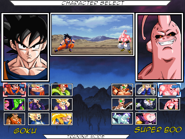
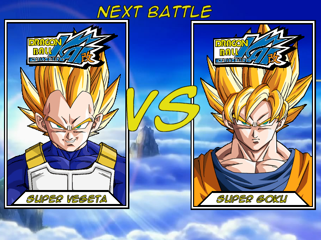
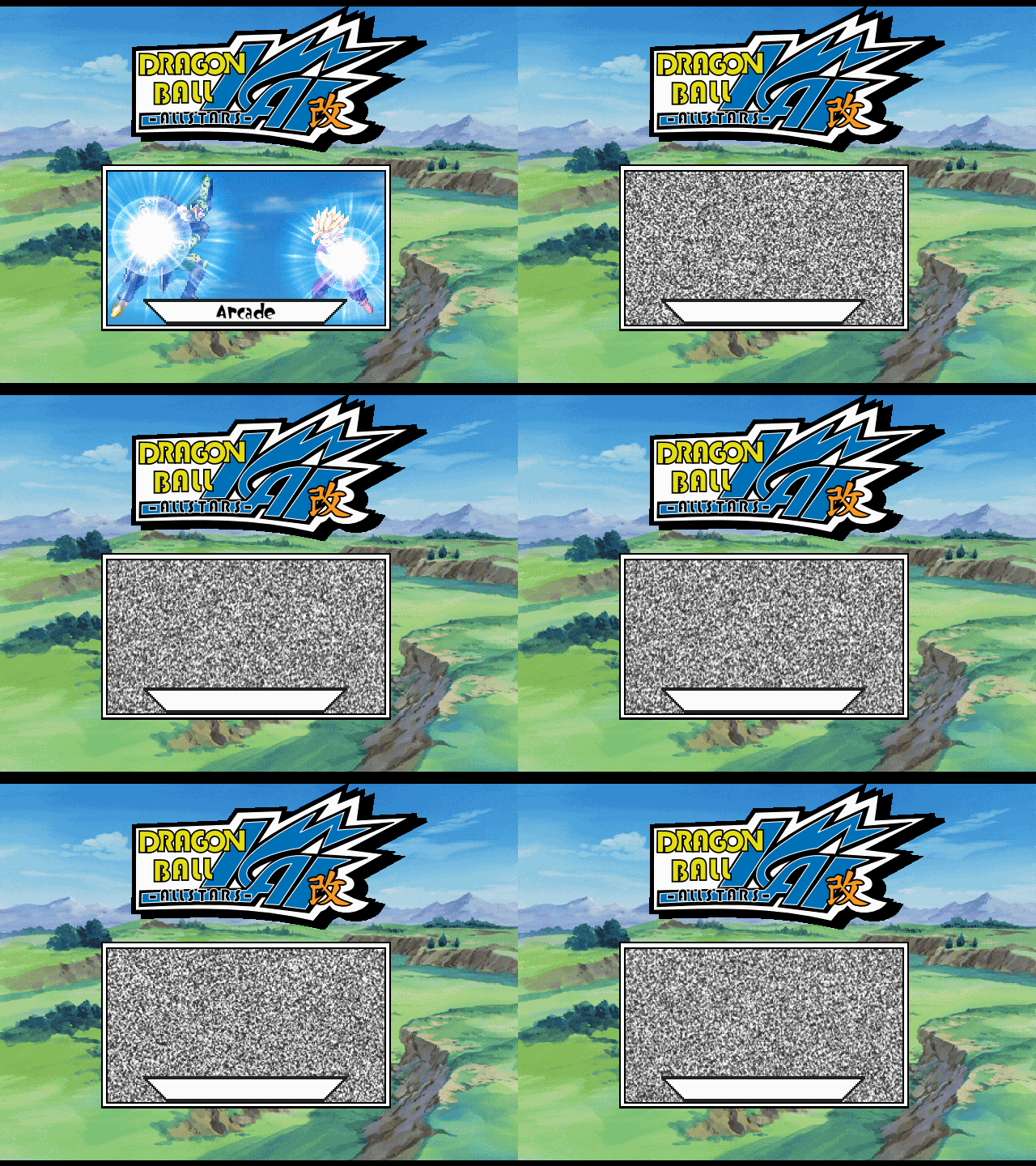
  • ****
    • Poland
I thought you making standard LV1, LV2 & LV3 supers so why 5 powerbars ? Personally i would like to see something more Budokai'ish but they looks fine.
"If our lives are indeed the sum total of the choices we've made, then we cannot change who we are. But with every new choice we're given, we can change who we're going to be." The Outer Limits S04E04

"If knowledge is power and power corrupts... how will human kind ever survive?" The Outer Limits S04E16
Re: ScreenPack
#3  January 11, 2011, 01:29:15 am
  • *****
  • Smooches
    • USA
    • Skype - Neocide
because the bars I took those from had 5 slots, and 5 max bar is fine, just because they go to 3 levels in supers doesnt mean they have to have 3 bars,

also these bars are from budokai tenkaichi 2, and will have the same effect as the original budokai bars had by being transparent.
Re: ScreenPack
#4  January 11, 2011, 08:59:24 am
  • ******
  • Limited time to use Infinite power !
    • France
    • network.mugenguild.com/cybaster/
High res bars would look better with high-res portraits (maybe you're just showing a concept anyway). And faces look better than an ingame sprite.

About the select screen, what will you be using the fill in the black spot ?
Re: ScreenPack
#5  January 11, 2011, 12:09:11 pm
  • ******
  • Legendary XIII
  • I am the eye of the storm to come!
    • New Zealand
    • network.mugenguild.com/cyanide/
Agree on the HR portraits.


Quick, not done yet but coming along OK. Neo, please come up with what you want to do about the names. Above, below, not there at all? tbh, when it comes to 2 player you need to do something really different with the portraits. Maybe another special one for player 2 that's poking out behind p1's or something. You can define something other than 9000,0 every step of the way here. So you could have half and half heads in simul and have them joined to create a single head.

Turns dunno, probably 4 really small singleplayer portraits. Or 2 half and half heads. Obviously if you picked 2 vegeta's you'd get a single vegeta head.


In M.U.G.E.N there is no magic button

They say a little knowledge is a dangerous thing, but it's not one half so bad as a lot of ignorance.
Re: ScreenPack
#6  January 12, 2011, 05:34:05 am
  • *****
  • Smooches
    • USA
    • Skype - Neocide
Re: ScreenPack
#7  January 12, 2011, 08:10:21 am
  • ******
  • Limited time to use Infinite power !
    • France
    • network.mugenguild.com/cybaster/
I'd say HR portraits DB Kai style.
Or even better, you code the portraits in the characters themselves, and have 3 portraits per character : 1 smiling (normal state), one with mounth open agressively (attacking), one mouth shut hurt (when getting hit), a bit like they did in this old DBZ game : http://www.youtube.com/watch?v=aVxuvef0hKU&feature=related
This would add interactivity and life, while not being overcomplicated to do.
Re: ScreenPack
#8  January 12, 2011, 09:12:21 am
  • *****
  • Smooches
    • USA
    • Skype - Neocide
so basically in the art style of the dbk intro? which is basically most of the art from all the video games from the current era(the budokai's) also about the select screen, I dont have any ideas as of yet to put in the back.

Re: ScreenPack
#9  January 13, 2011, 01:13:25 am
  • ***
    • Chile
    • mkvssf.com/
I Like the Game Good Luck!

Well about the portraits I Make something for you:

It Doesn't looks very well but is functional, in scale 0,5 looks nice :sugoi:


And I Think that the distance between the portrait and the lifebar should be shorter (In Normal Mode)
Last Edit: January 13, 2011, 05:32:42 am by [ƒıЯ£-ŁØřĐ]
Re: ScreenPack
#10  January 13, 2011, 01:53:54 am
  • *****
  • Smooches
    • USA
    • Skype - Neocide
I'm not in a giant rush for the portraits, so I'd rather get something thats really nice looking than something thats just functional, thanks though. ;) as for the lifebars. I think they are fine the length they are.
Re: ScreenPack
#11  January 13, 2011, 05:35:18 am
  • ***
    • Chile
    • mkvssf.com/
Well, if you use these distance, you can use custom portraits check this:
Re: ScreenPack
#12  January 13, 2011, 01:58:26 pm
  • ****
    • Poland
To be honest I'm all for animated portraits but I'm kinda prefer sprite portraits over drawed ones. So I'm with neocide on this one.
"If our lives are indeed the sum total of the choices we've made, then we cannot change who we are. But with every new choice we're given, we can change who we're going to be." The Outer Limits S04E04

"If knowledge is power and power corrupts... how will human kind ever survive?" The Outer Limits S04E16
Re: ScreenPack
#13  January 14, 2011, 11:49:18 pm
  • *****
  • Smooches
    • USA
    • Skype - Neocide
I actually have some  a friend showed me I'm going to use, just waiting for him to get back online to show you guys the design.  Also if anyone knows any good flash effect program (where I can make flash styled effects or somewhat cel shaded etc.)
Last Edit: January 15, 2011, 12:11:41 am by Neocide

HQ

Re: ScreenPack
#14  January 19, 2011, 12:37:17 am
  • ****
Hey guys, I am voidednumb and I am helpin' on the screenpack  :sugoi:


here some old concepts of the select screens:


an old mainscreen concept (in old screen size  --; )


here is an lifebar remake preview (in progress):


and here is the totally remade logo of Dragonball Kai: Allstars (also in progress, as you can clearly see on the dragon ;) )


so where do we need help:

I really need some help on the options and the main screen...do you guys have any good ideas???
Re: ScreenPack
#15  January 19, 2011, 01:50:33 am
  • ***
    • Chile
    • mkvssf.com/
Hey guys, I am voidednumb and I am helpin' on the screenpack  :sugoi:
here some old concepts of the select screens:


I Like this but add more effects.... and use the same style portraits for all characters something like this for example

for Goku:

for Vegeta:

for Piccolo:
Re: ScreenPack
#16  January 19, 2011, 08:25:52 am
  • *****
  • Smooches
    • USA
    • Skype - Neocide
that was a older design for the select screen.

cy if you read this, the res for the game is 720 now so the bars can be bigger forgot to mention that
Re: ScreenPack
#17  January 20, 2011, 01:55:25 am
  • ******
  • Legendary XIII
  • I am the eye of the storm to come!
    • New Zealand
    • network.mugenguild.com/cyanide/
sigh, that means recoding and repositioning everything. Great, thanks, get me the new stuff whenever and i'll probably do something about it.


In M.U.G.E.N there is no magic button

They say a little knowledge is a dangerous thing, but it's not one half so bad as a lot of ignorance.
Re: ScreenPack
#18  January 26, 2011, 01:51:40 am
  • **
  • "let´s put a smile on that face"
    • www.gmugen.com/
hey there!

honestly the select screen, it doesnt convence me... I know u are working too hard alone, hope somebody of this site can help u, specially in this thing of SP.

My personal opinion, I would like see something more unique, your idea is not bad, but the images are too basic.

Maybe something like this select:
http://www.youtube.com/watch?v=tfheE2p6bD8

I mean the distribution, and style of select (not graphic), could be cool.

Anyways good luck with your game, is looking great.
Re: ScreenPack (Main Menu,Select Screen,Vs Screen)
#19  May 23, 2011, 09:44:32 pm
  • *****
  • Smooches
    • USA
    • Skype - Neocide
ok I think everything for the screenpack is done,and here it all is.


I kept everything pretty simple, since well I'm doing it all myself, graphic wise.

Spoiler, click to toggle visibilty
Re: ScreenPack
#20  May 24, 2011, 03:02:27 pm
  • ****
    • Poland
Wait so each form will be separate character ? I thought you will go for transformations snce that throw glitch is fixed in Mugen 1.0 It could be cool to have transformable characters done in right way.

On Topic:
Yes fairly simple design but I like it. No complains from me.  BTW I love game logo :P
"If our lives are indeed the sum total of the choices we've made, then we cannot change who we are. But with every new choice we're given, we can change who we're going to be." The Outer Limits S04E04

"If knowledge is power and power corrupts... how will human kind ever survive?" The Outer Limits S04E16